 Brand Guidelines
How Raised Media looks, sounds, and moves.
The working system behind everything we put into the world. Not a rulebook for its own sake. A reference so the brand stays sharp no matter who touches it, including us.
Overview
Raised Media Co. is a video production and photography agency in New York, New York. We make videos people watch to the end, for brands that care how their story looks when it reaches the world.
The identity is built the way we build a set. Calm, considered, and arranged so the work is always the loudest thing in the room. Four principles run through every choice in this document.
The work leads
The identity frames the work and never competes with it. Quiet type, restrained color, a white mark. The footage stays the loudest thing in the room.
Calm is confidence
Thin headlines, generous space, a palette that barely raises its voice. Brands that are sure of themselves don't shout.
Built for both ends
One system that sits beside a global bank on Monday and a couture house on Friday. Sharp where it needs structure, soft where it needs style.
Made for the screen
Born in video. Dark grounds, restrained motion, and layouts that hold up from a phone to a cinema screen.
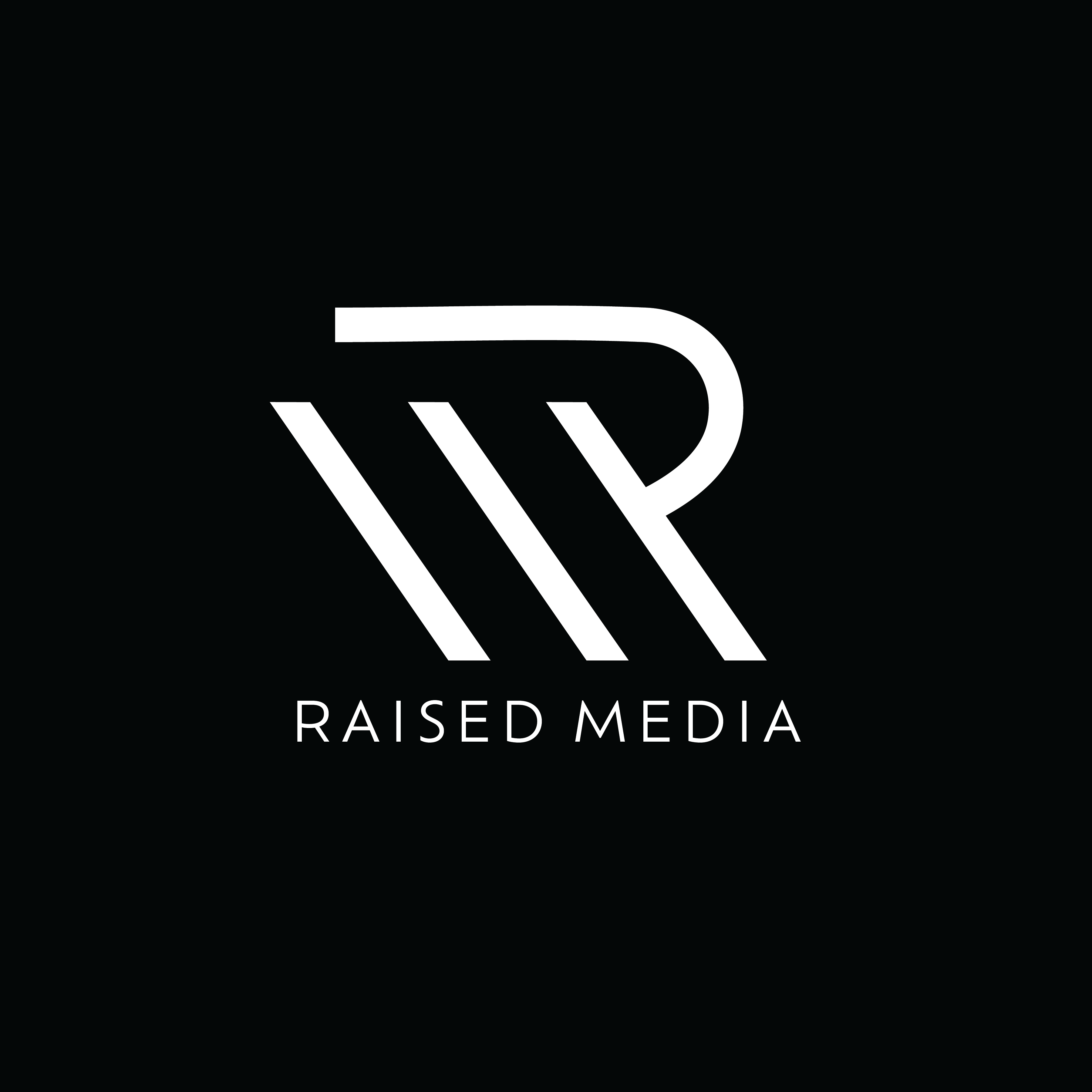
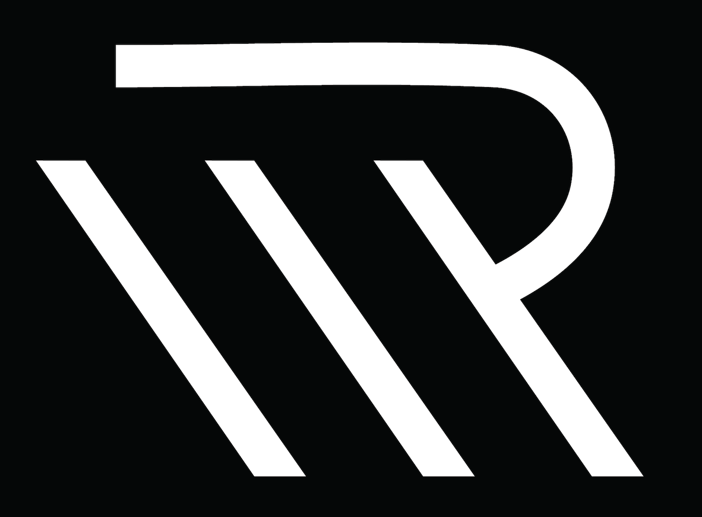
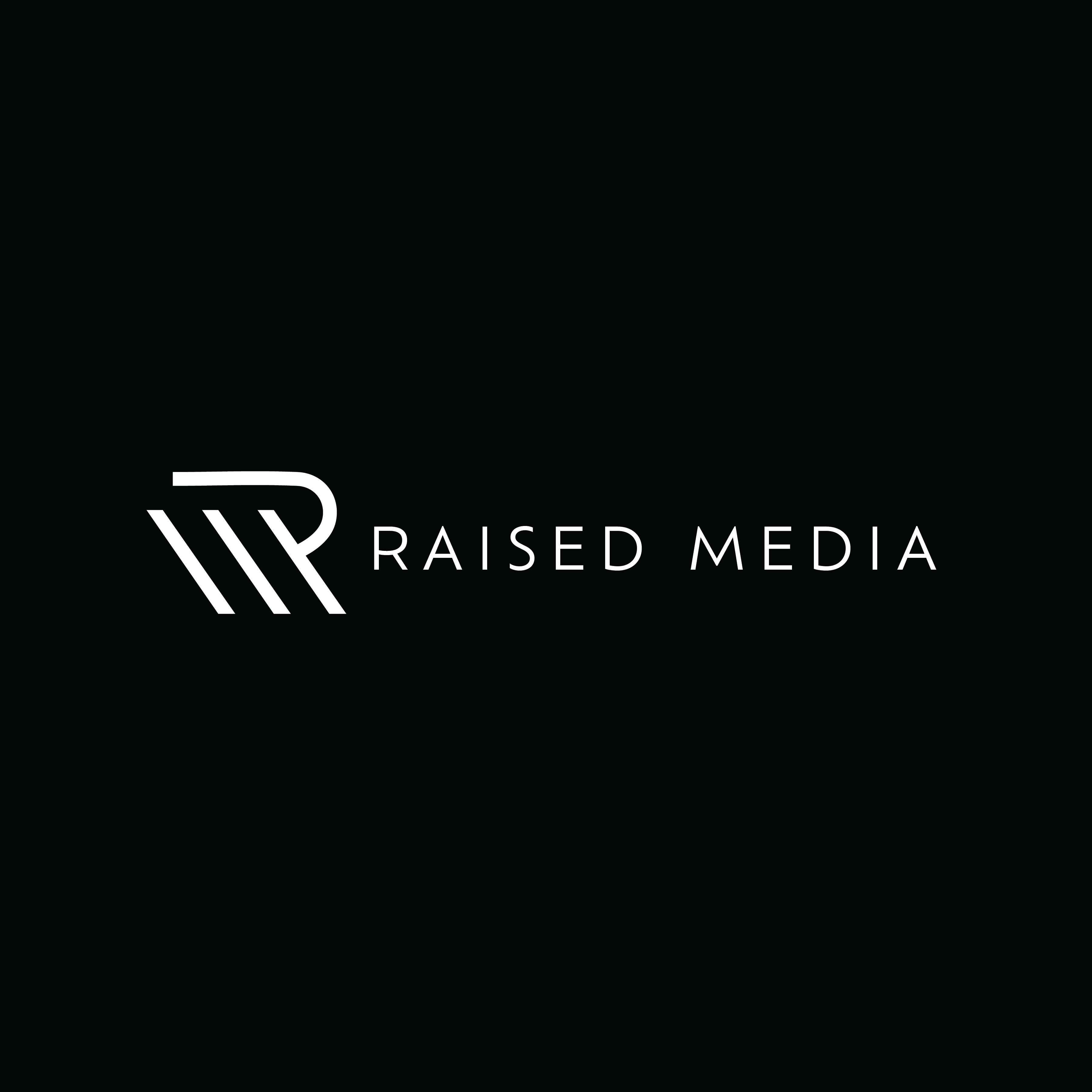
Logo
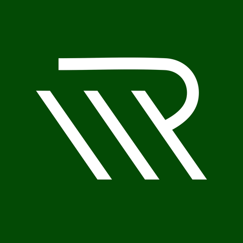
The mark is an R and an M sharing the same body. Three parallel strokes rise left to right and carry the M. The bowl closes the R over the final stroke.
It was designed in-house, and the brief fits on one line. Draw momentum. Every stroke climbs up and forward, so the name is in the drawing. Raised, literally. The R leans ahead because the company does. And the mark is sharp and curved in the same breath, hard angles meeting one soft bowl, because our clients live on both ends. Corporate one day, couture the next.
There's no color in the mark, and that's a decision, not a gap. The logo stays white so it never competes with the work, or with a client's brand sitting beside it. The work brings the color. The mark brings the signature.
Versions
The mark is white. Always. It sits on ink, black, or emerald. The logo shows up where the work does, on screens, in dark rooms.
Which one, when
| The Mark | Avatars, favicons, slates, watermarks, anywhere space is tight or the name is already established. |
| Stacked | Center-aligned moments. Title cards, end frames, merch, the default hero of the identity. |
| Inline | Headers and horizontal layouts, anywhere width wants filling. |
| On Emerald | Social avatars and brand-color applications. The one place the mark and the primary color meet. |
Naming
The lockup says Raised Media. In writing, the company is Raised Media Co. On paper, it's Raised Media Company LLC. Three lengths of the same name, shortest where space matters most.
Clearspace and minimums
Keep clearspace equal to the width of one stroke of the mark on all sides. Nothing enters that zone, including type, imagery, and edges. Minimum sizes are 24px tall for the mark alone and 120px wide for either lockup. Below that, use the mark.
Never
- Don't stretch, squash, or rotate the mark
- Don't recolor it. The mark is white, no exceptions
- Don't put a dark version on a light background. It doesn't exist on purpose
- Don't add outlines, shadows, glows, or effects
- Don't set it over busy imagery without a dark scrim
- Don't rebuild the wordmark in another typeface
- Don't shrink it past legibility (24px for the mark, 120px wide for lockups)
Color
Six colors, locked. The palette is mostly quiet, paper and cream carrying the weight, with emerald and gold doing the talking in small doses.
The operating principle is light majority, dark anchors. Layouts run light, with occasional ink sections for contrast and weight. Emerald accents light backgrounds, gold accents dark ones. When a headline needs an accent word, it goes emerald on light and gold on dark, often in italic.
Supporting values
| Body on light | #3A3B36, a soft near-black. Pure ink is for headings. |
| Body on dark | rgba(242, 238, 228, .74), cream at reduced strength. |
| Hairlines | rgba(20, 20, 20, .12) on light, rgba(242, 238, 228, .16) on dark. Dividers, not boxes. |
Typography
One typeface. Figtree, everywhere. The signature move is big headlines set light, weight 300, with tight tracking. Thin type at large sizes reads calm and expensive, and it lets the work stay the loudest thing on the page.
The technical accent
Fragment Mono handles the small stuff. Kickers, indices, timecodes, labels. It's the film-set layer of the identity, the type equivalent of a slate. Small sizes only, wide letterspacing, uppercase.
01 — LIKE THIS. NEVER FOR HEADLINES, NEVER FOR BODY.
Scale
| Display | clamp(40px, 8vw, 118px), weight 300 |
| Section | clamp(32px, 5.5vw, 84px), weight 300 |
| Lead | clamp(20px, 2.4vw, 34px), weight 300 |
| Body | clamp(15px, 1.15vw, 17px), weight 400, line-height 1.5 to 1.65 |
| Kicker | ~12px, weight 600, uppercase, letterspacing .18 to .24em |
Voice
We talk like a creative who has been in the room, not a brand manager who has been in a boardroom. Confidence comes from specifics, never adjectives.
We're a production company. A good one. Most of our clients are surprised by how smooth it goes. We're not.
We never picked a lane, because our clients don't live in one.
Based in New York. We go where the work is. If the project matters, we pack up and show up.
Same voice, three surfaces. The palette changes, the register doesn't.
How it sounds
- Plain language. If a sentence needs a translator, it gets rewritten. We explain production the way we'd explain it across a table.
- Specifics over adjectives. We name the venue, the format, the turnaround. The details do the convincing, not the superlatives.
- Confident, never loud. No overselling, no hype. The work carries the volume, the words stay calm.
- Boutique, on purpose. Small team, senior hands. We sound like the people who actually show up on set, because we are.
- A little dry. New York, not corporate. Warmth with an edge, humor that doesn't try too hard.
Motion
Motion is understated and earns its place. One easing curve everywhere, cubic-bezier(.2, .7, .2, 1). Smooth in, soft landing.
| Reveal | Sections fade up on scroll, opacity 0 to 1 with a 30px rise, children staggered slightly. |
| Imagery | Grayscale at rest, full color on hover. The work blooms when you reach for it. Mobile shows full color. |
| Hover | Rows and tiles reveal a little more. A label, a caption, a growing image. |
| Signature | One pinned or dissolving scroll moment per page, maximum. A trailer moment, not a theme park. |
| Respect | prefers-reduced-motion always gets a calm, static experience. |
In use
Where the system meets the real world.
| Video watermark | The mark, white, low opacity, corner placement. Never over a face. |
| Lower thirds | Figtree. Name at 600, title at 400 in grey or cream. No boxes unless the footage demands one. |
| Slates & end cards | Stacked lockup, centered on ink or emerald. Fragment Mono for the project metadata. |
| Social | The mark on emerald as the avatar. One brand color in the feed, everywhere, always. |
| On set & merch | The branded world. Director's chairs, jackets, slates. The mark earns physical objects; the wordmark earns embroidery. |
Referring to us
Writing about us, crediting us, or putting us in a program? Here's the official language, ready to copy.
Raised Media Co. is a video production and photography agency in New York, New York.
By context
| Press & articles | The film was produced by Raised Media Co., a video production and photography agency in New York. |
| Event programs & credits | Video & Photography: Raised Media Co. |
| Festival & screening credits | Produced by Raised Media Co., New York |
| Social | Production: @raisedmediaco |
The name
Raised Media Co. on first mention, Raised Media after that. Always "Raised," never "RMC" in public writing. On social we're @raisedmediaco everywhere.
Need something this page doesn't cover?
Assets in another format, a question about usage, or a credit situation we didn't think of. One email, quick answer.
hello@raisedmediaco.com