
Strategy
A great restaurant can have a website that fights it, a PDF menu, a stock photo, tiny type. Here's what restaurant website design should do instead.
Strategy
A great restaurant can have a website that fights it, a PDF menu, a stock photo, tiny type. Here's what restaurant website design should do instead.
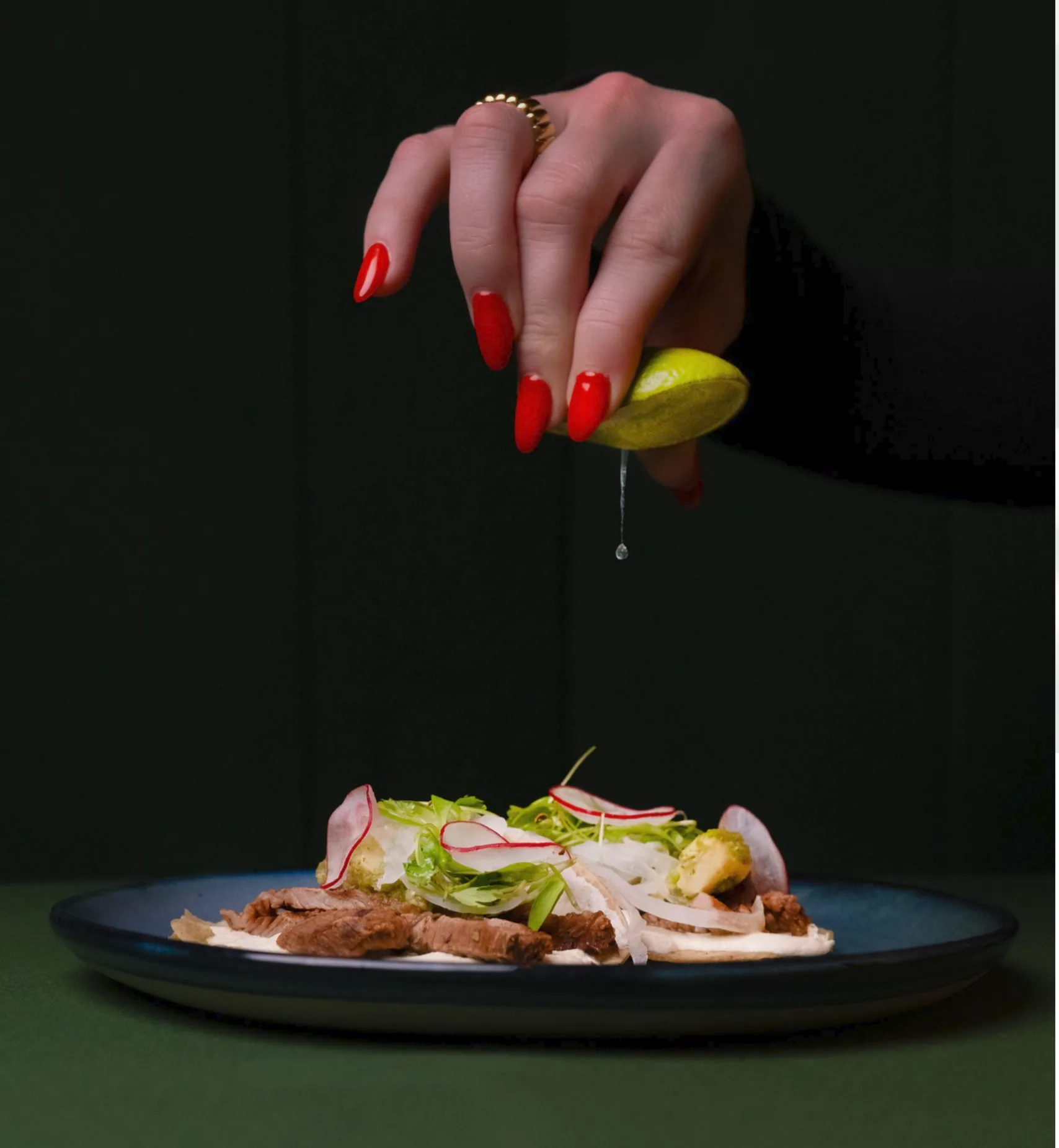
You hear about a place. Great reviews, a friend who won't stop bringing it up. You look it up, and the site is a PDF menu from 2014, a couple of photos with the flash on, and a phone number set in a font nobody chose on purpose. Somehow you're less hungry than you were a minute ago.
That's the strange thing about restaurant websites. The restaurant nails the room, the lighting, the plating, every detail you feel the second you walk in, and then the website undoes all of it in about four seconds.
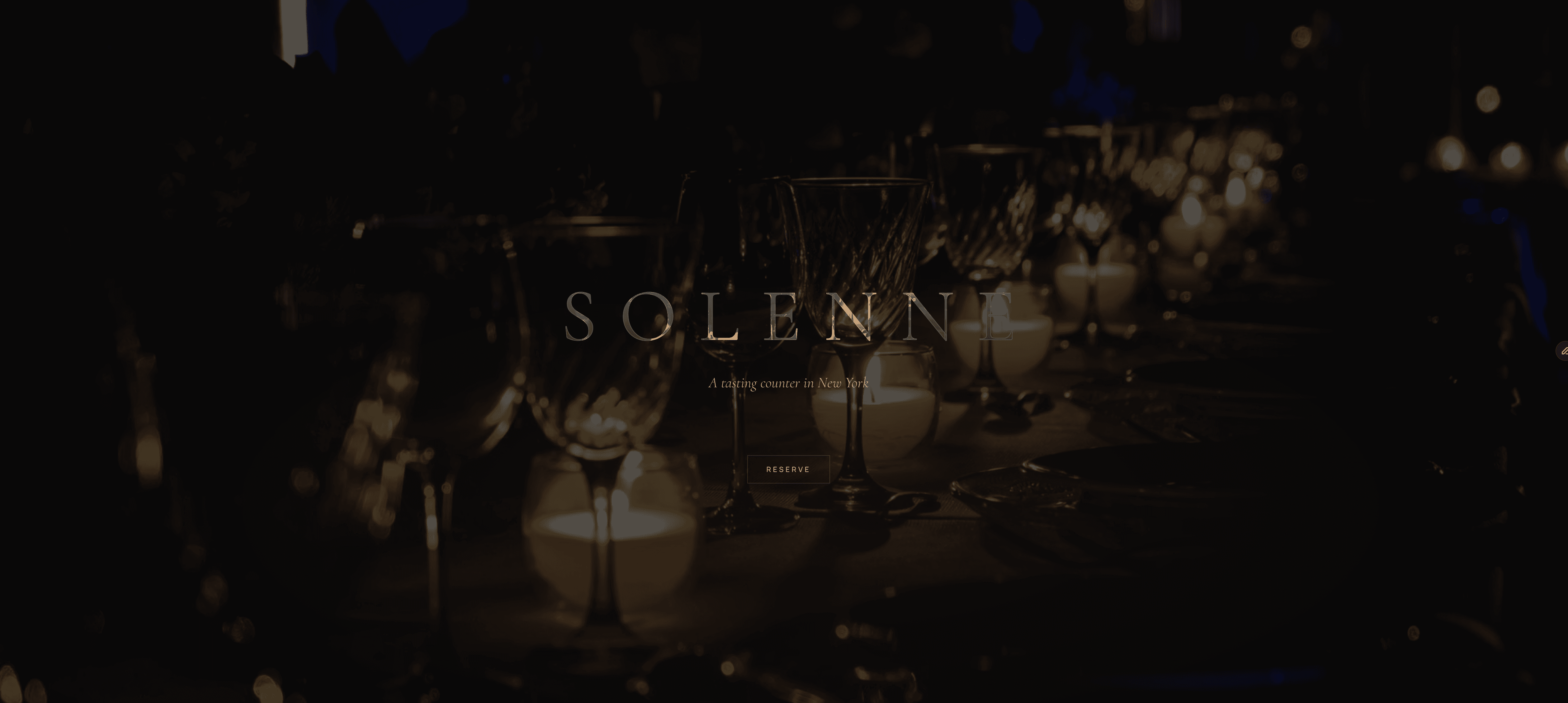
A restaurant spends a fortune getting the feeling right. The warmth, the noise level, the smell when the door opens. Restaurant website design is that same job moved online, and it's usually the first version of the room a new guest ever sees.
So the page has one thing to do before anything else. Make you hungry. The menu and the hours and the reservation link all matter, obviously, but if the page doesn't carry the mood, none of that gets a chance.
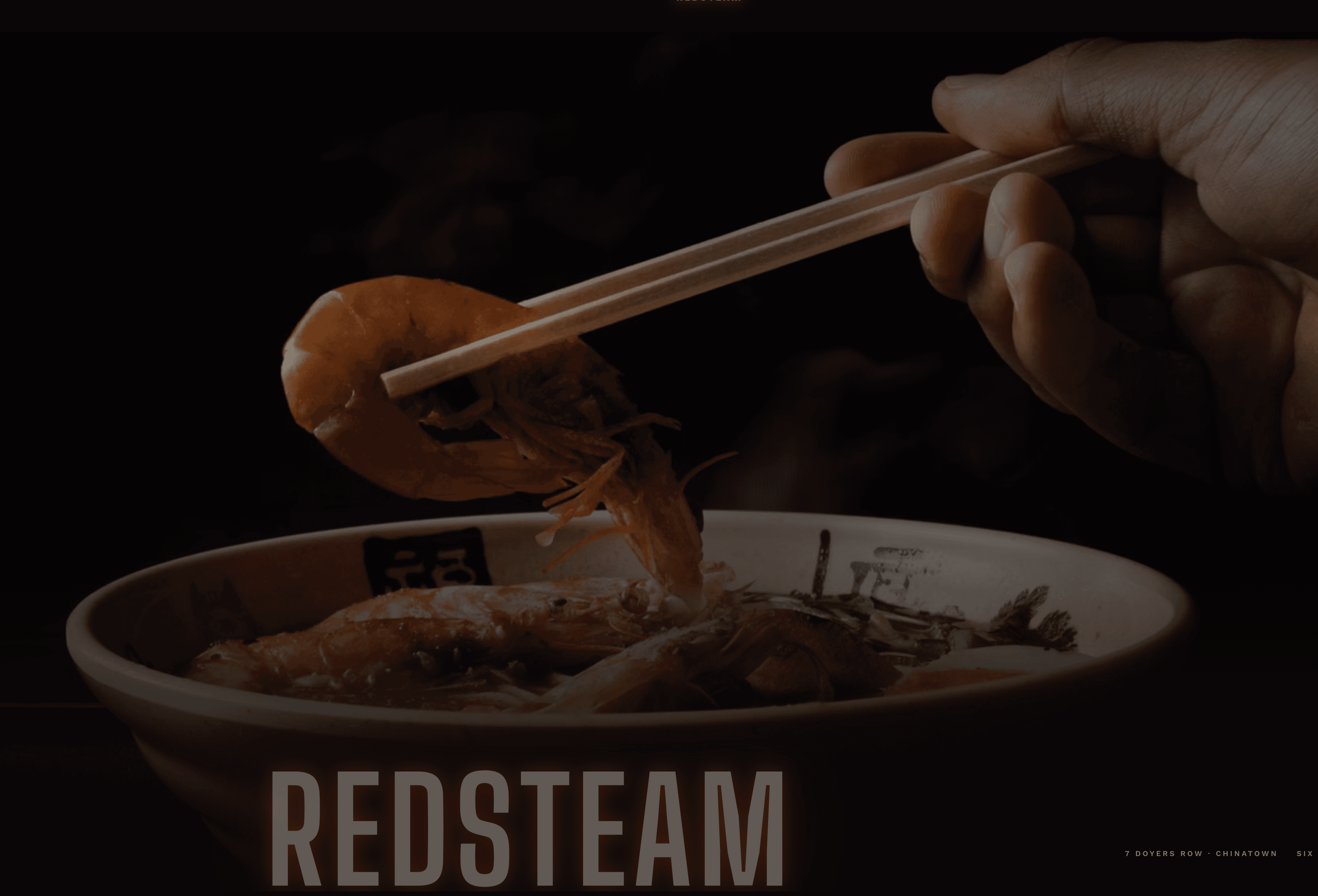
Here's what quietly kills most of these sites. The photos. A phone snap of a dish under fluorescent light does more damage than no photo at all, and stock images of food that isn't your food are worse.
We spend a lot of time around restaurants and the brands behind them, and the thing you learn fast is how specific a restaurant's identity is, the typeface, the color, the exact character of the place. Real commercial photography of the real food, in real light, is the difference between a page that sells a Tuesday night and one that gets scrolled past. (If you care which kind, we got into it in white background or real life.)
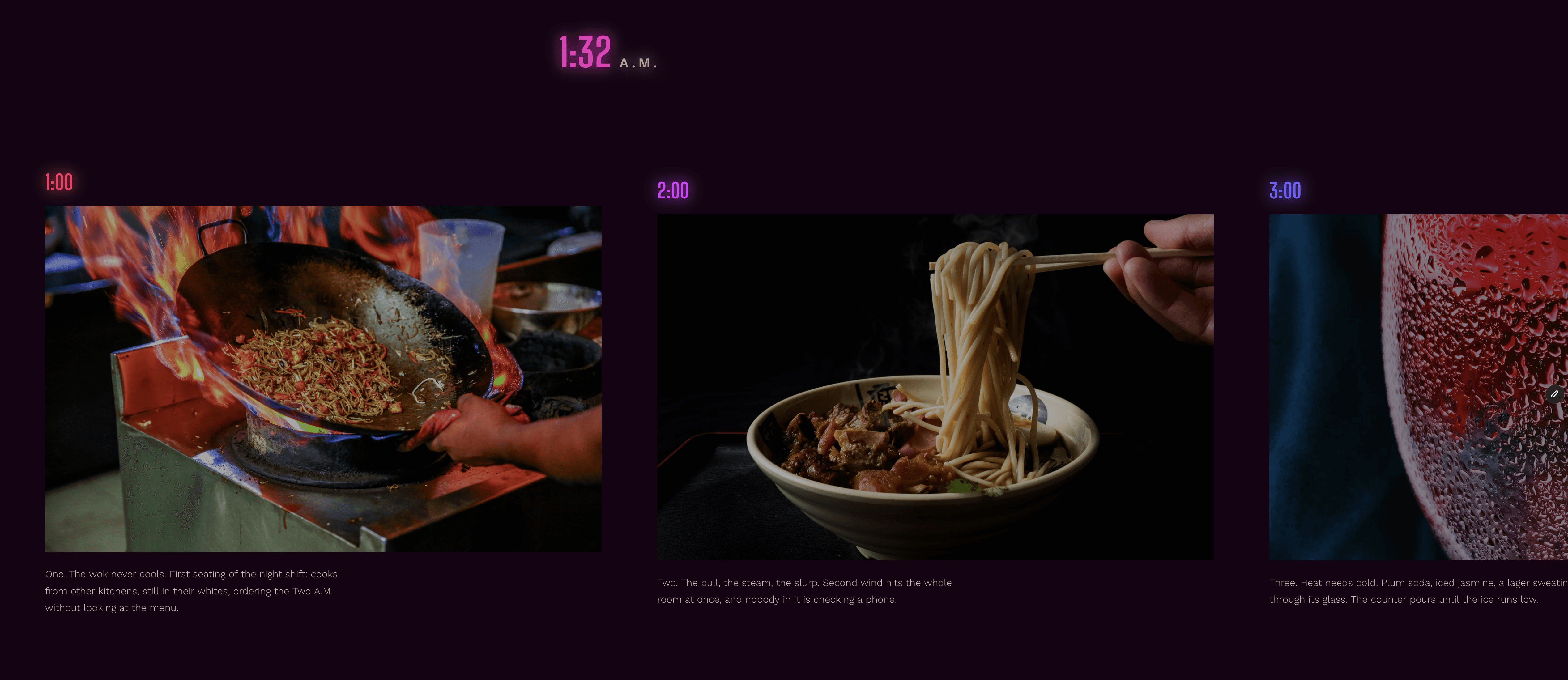
A new guest meets the restaurant on a phone, long before they smell the kitchen. That first impression is the website, whether you built it on purpose or not, and most places leave it to a booking widget and a logo. Plating a signature dish on a paper towel, basically.
Set the table instead. Show the room at its best hour, the light you have, the plates you send out (yours, not a stock photographer's). Then make booking a two-tap thing, because a hungry person hunting for the reservation link is a hungry person eating somewhere else tonight.
A restaurant doesn't need a fifteen-page website. It needs one good page that loads fast on a phone, because that's where every hungry person is deciding from, usually already halfway to a yes.
Menu, a real sense of the place, hours, location, a reservation button that works, big warm photos. That's the site. Anything heavier just gets between a person and a table.
Almost nobody walks in cold anymore. They Google the name, glance at the page, and decide in a few seconds whether tonight's the night. The page is doing sales work at the exact moment of the decision, and a stale one loses the table right there.
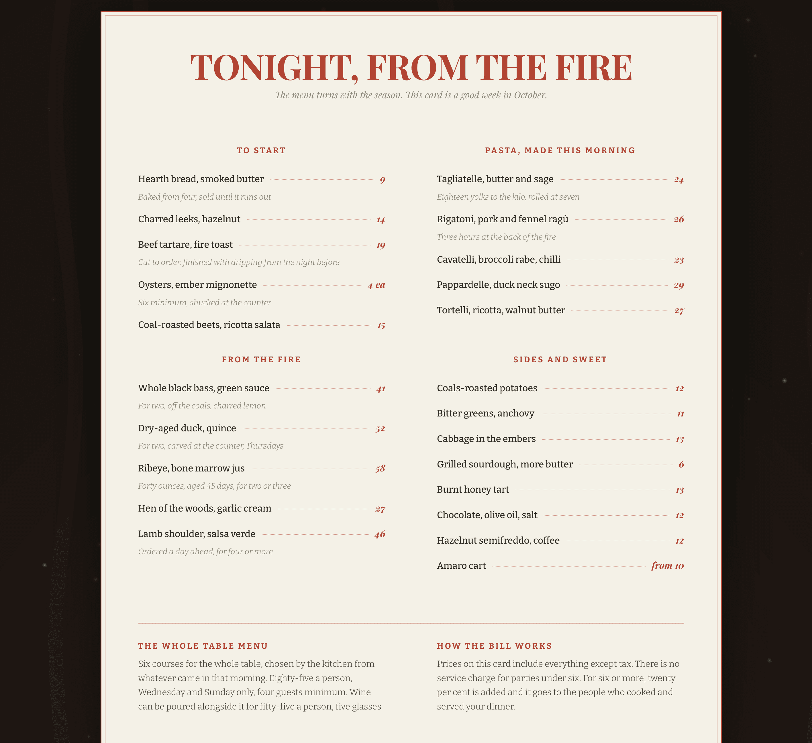
It also has to stay current without a developer on call. Menus change, specials change, hours shift around a holiday. A good restaurant page is easy to keep true, because nothing kills trust faster than showing up for a dish the site promised and the kitchen retired months ago.
The version worth making feels like walking in. It opens on the room and the food, moves the way the place moves (loud and fun, or quiet and candlelit, whichever you are), and gets someone to book before they talk themselves out of it.
We make the photos and the video, and we build the page they live on, so the site feels like the restaurant instead of a template wearing its name. Anyway. Next time a website makes you hungry, notice it. It almost never happens by accident.
Raised Media Co. is a New York City visual production company. Video, photography, and web design, built for brands.